THE PROJECT
As the PowerDMS mobile app grew, our outdated methods of keeping our style guide up to date and accessible to the team was getting unwieldy, unorganized, and a huge pain in the bum.
We needed a Design System.
RESEARCH
A design system can be seen as a vast data library that acts as a single source of truth. It consists of reusable components, philosophies, applicable examples, and design guidelines that help the different teams involved remain on the same page - the ultimate goal. Design systems can benefit many groups within an organization, such as designers, developers, copywriters and project managers.
With a design system, teams have a full-proof source that allows them to maintain consistency and efficiency. End to end communication, we love to have it!
“Here’s the simple truth: you can’t innovate on products without first innovating the way you build them.”
―Alex Schleifer, Airbnb
the SYSTEM
Typography (Our apps maintained the OS’s default font family)
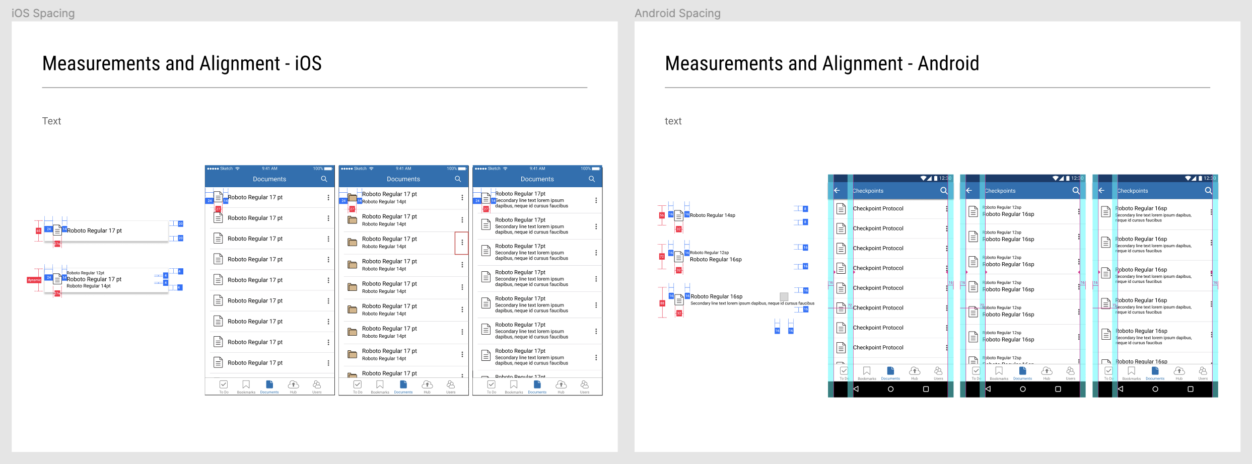
Sizing and Spacing
When designing for mobile platforms, it is very important to use correct sizing, UI elements, and interactions that adhere to each OS. What works for iOS, doesn’t always work for Android, and vice versa.
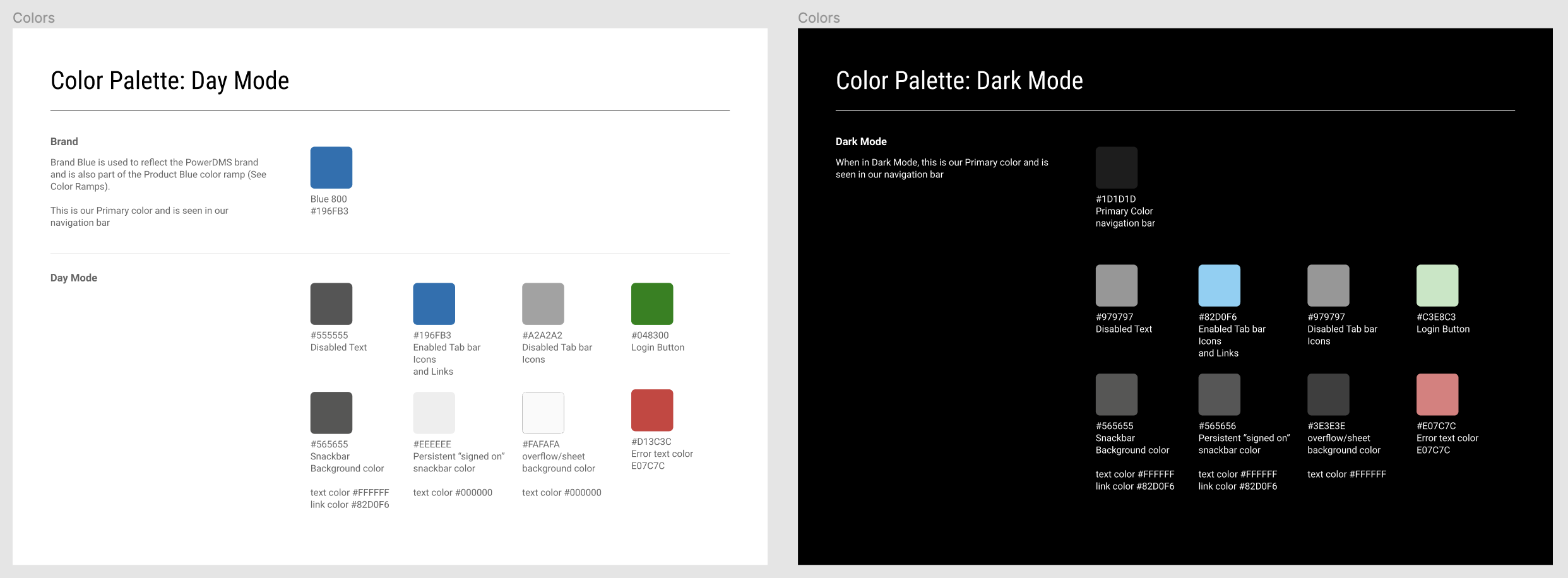
3. Color Palette
Don’t forget to include both Day Mode and Dark Mode when establishing your color palette!
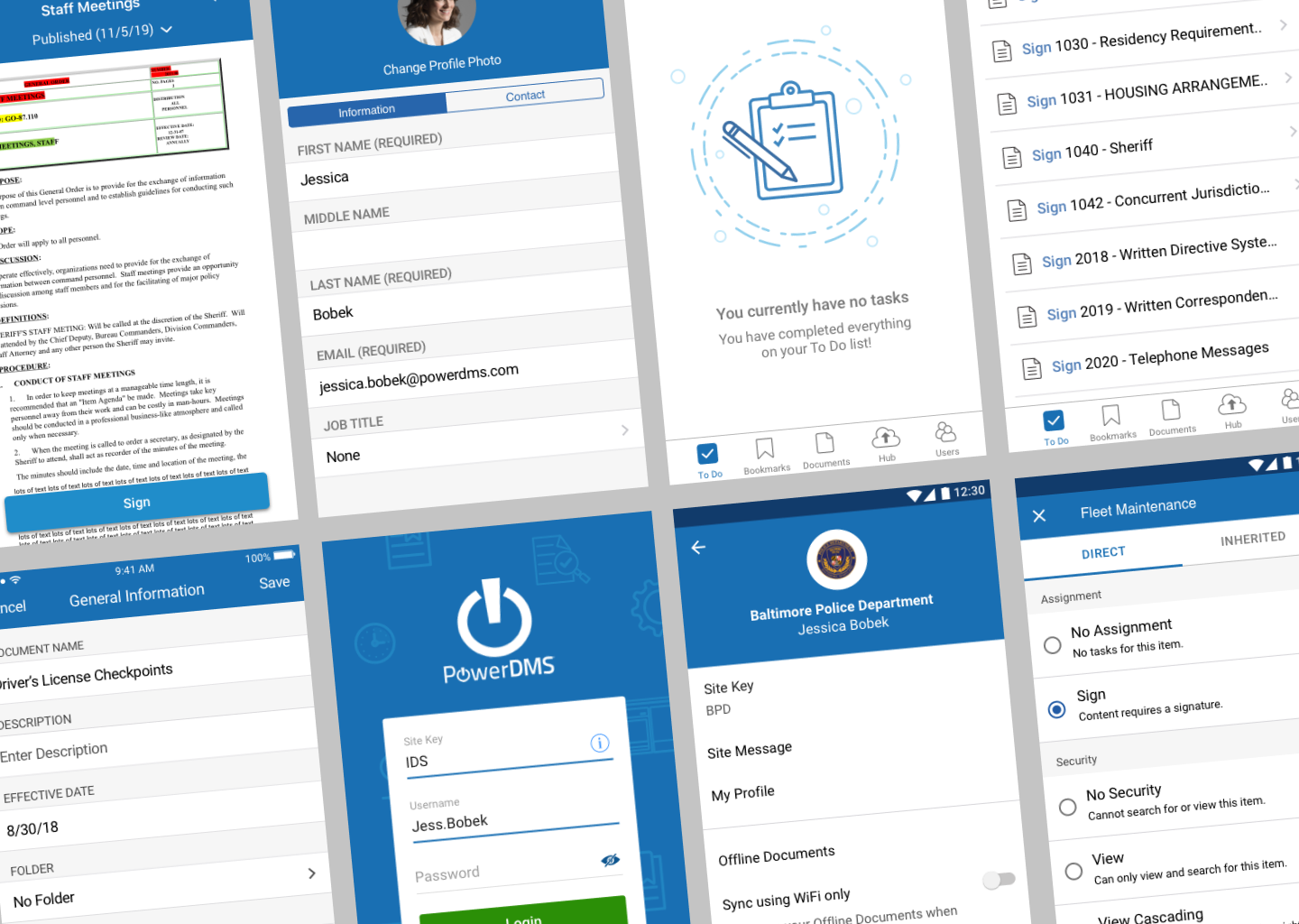
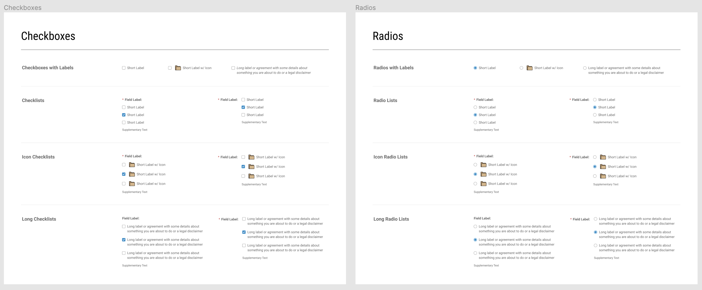
4. Components
These should be as detailed as possible and show variants of each element, if applicable.
Include details such as:
Checkboxes
Toggles
Radio Buttons
Fields and labels
Navigation
Text
Text Input
Buttons
Dialogs
Menus
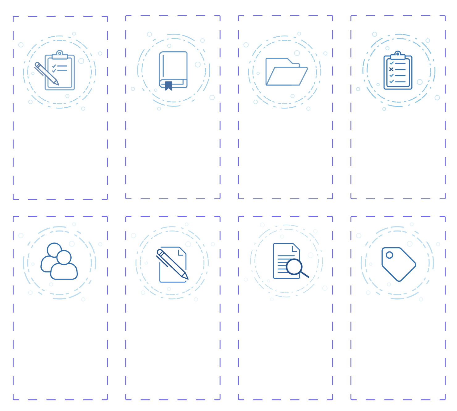
5. Iconography
Include Enabled, Disabled, Active and Hover states to create an efficient icon library.

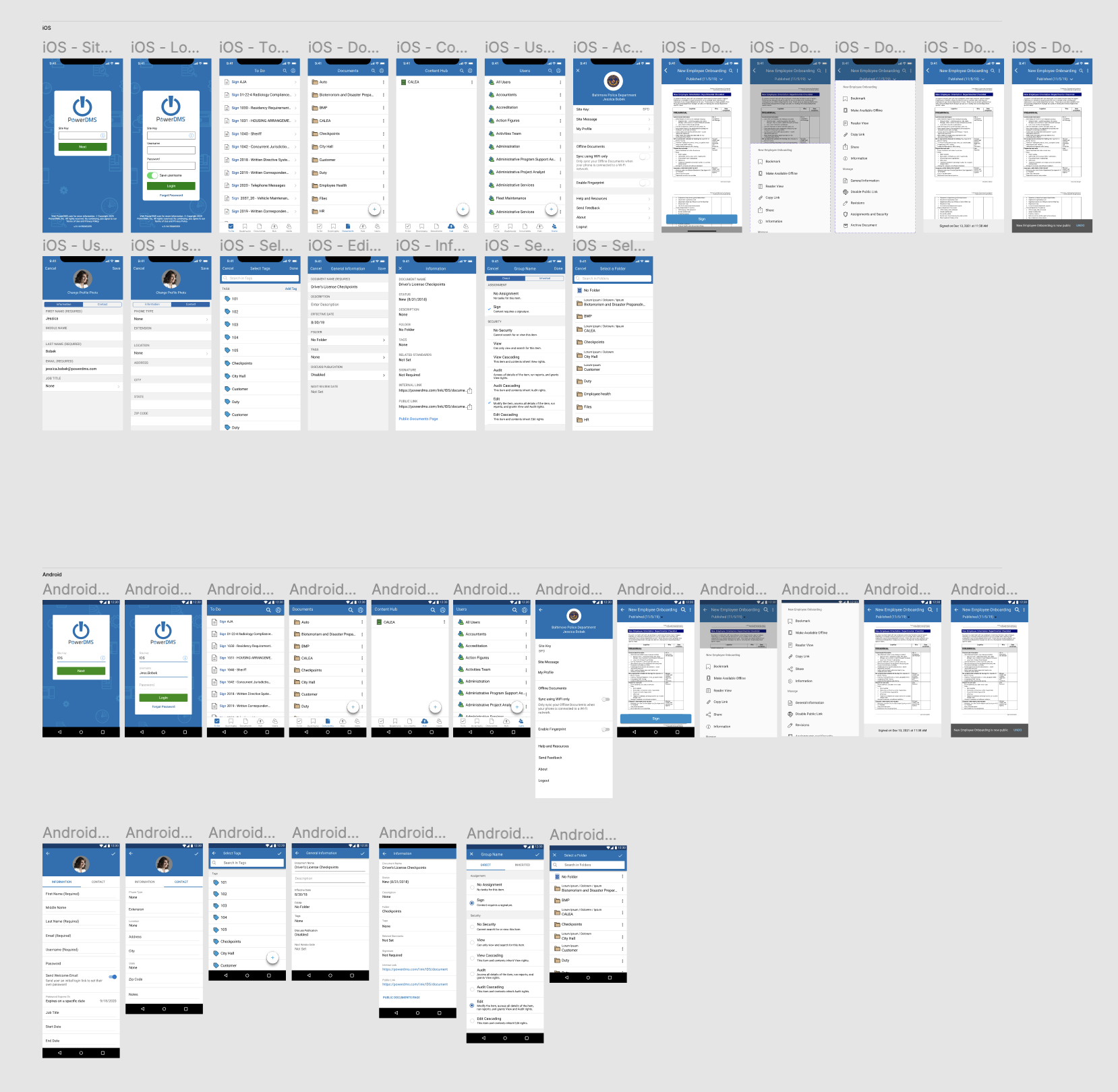
6. UI Library and Examples
7. Imagery/Illustrations
(The seemingly blank area contains empty states for Dark Mode)