
THe project
StrongVPN is a Virtual Private Network (VPN) that helps users bypass restrictions and censorship from hundreds of locations around the globe.
Strong owners wanted their product to have a new face. One they could include in their applications to create a consist brand and UI/UX across all platforms.
THE REBRAND
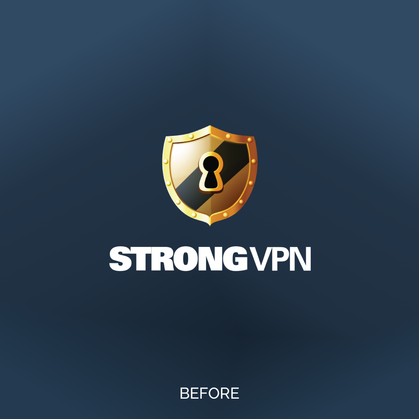
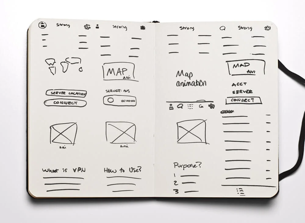
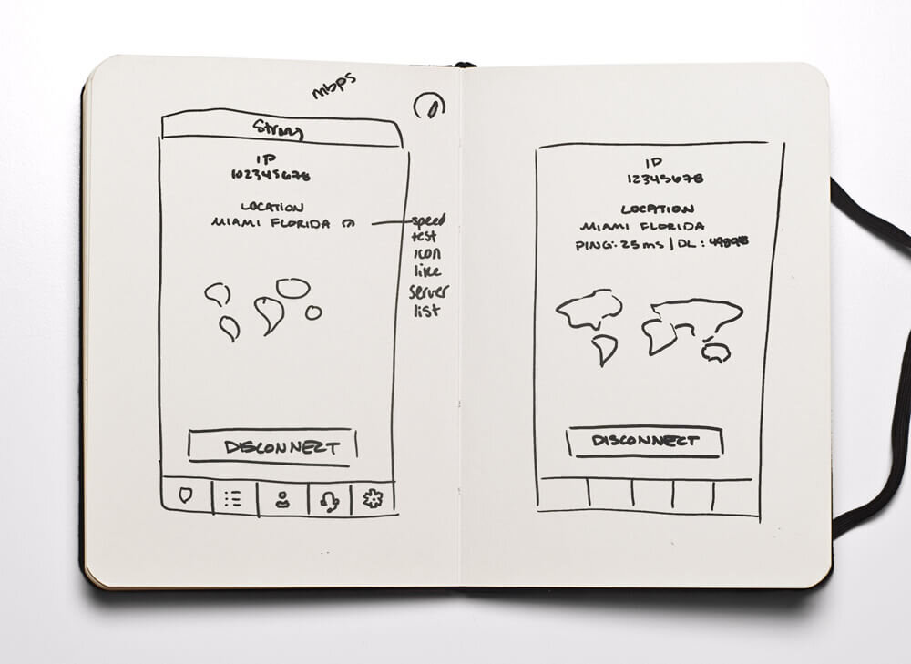
After hearing the direction the client wanted to gear their product towards, I immediately began sketching. In an effort to provide logos that were outside of the proverbial “VPN logo box” I began to explore objects that resonated with the word “Strong”. From mountains to elephants, I ventured through ideas both good and side splittingly bad. In the end? We found that the shield was the best route. Hey, if it ain’t broke, don’t fix it.
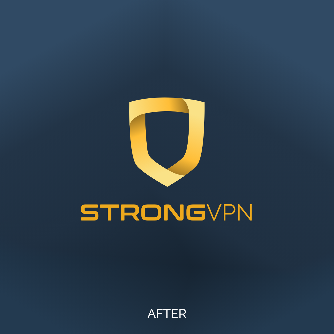
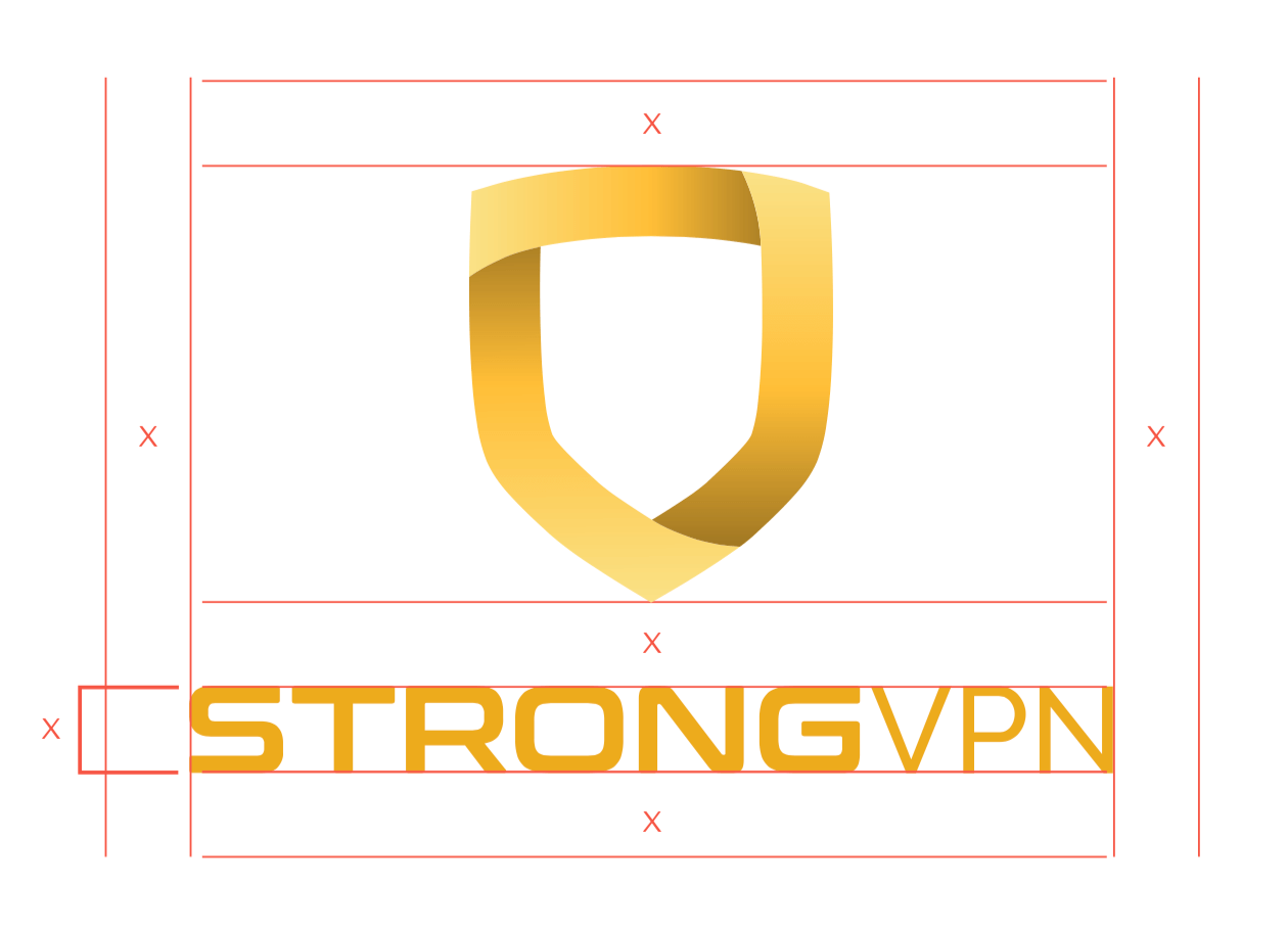
Complete with any rebrand, Branding Guidelines including appropriate use of Logo, spacing, color palette, etc were constructed. User Personas, new website landers and marketing were all ready to be revealed to the public.


THE APPs
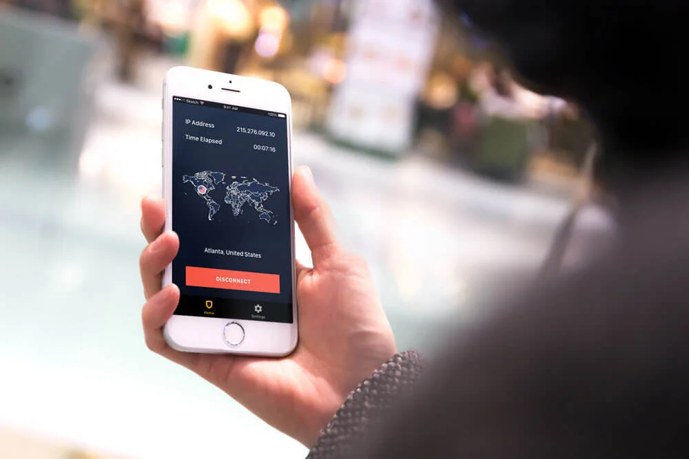
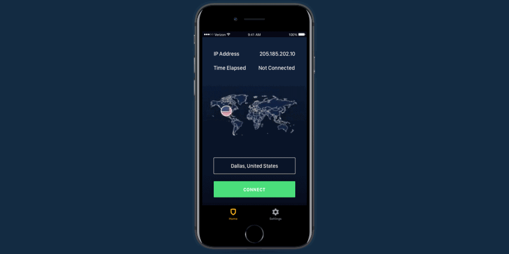
The inconsistency from platform to platform was blatant. StrongVPN needed a facelift, and now that we had a shiny new logo and branding, it was time to concentrate on giving that same attention to the apps.
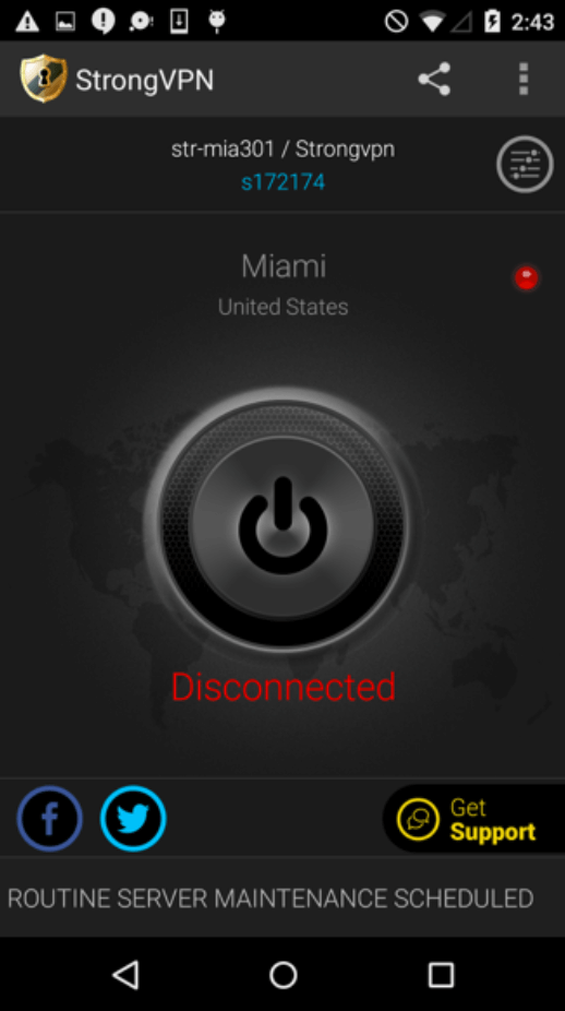
original StrongVPN - Android
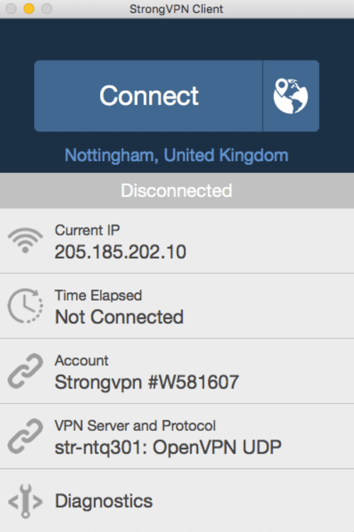
original StrongVPN - Desktop
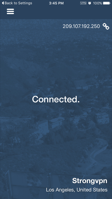
original StrongVPN - iOS
Key factors that we wanted to consider with this redesign:
Consistency and accessibility
What other attributes are valuable in the marketplace right now?
Which features are valuable that exist in other brands?
Improvements to existing features
How can we bring joy to the product through animation? / How can we best show the user what is happening?
With the help of Sprint planning, competitive analysis and a damn good team of developers and marketing, we began planning!
THE RESULTS
““StrongVPN hits just the right balance for presenting information to make a useful decision, and doesn’t overwhelm with too much information. This goes to show just how helpful a little consideration in app design can be. Well done.”
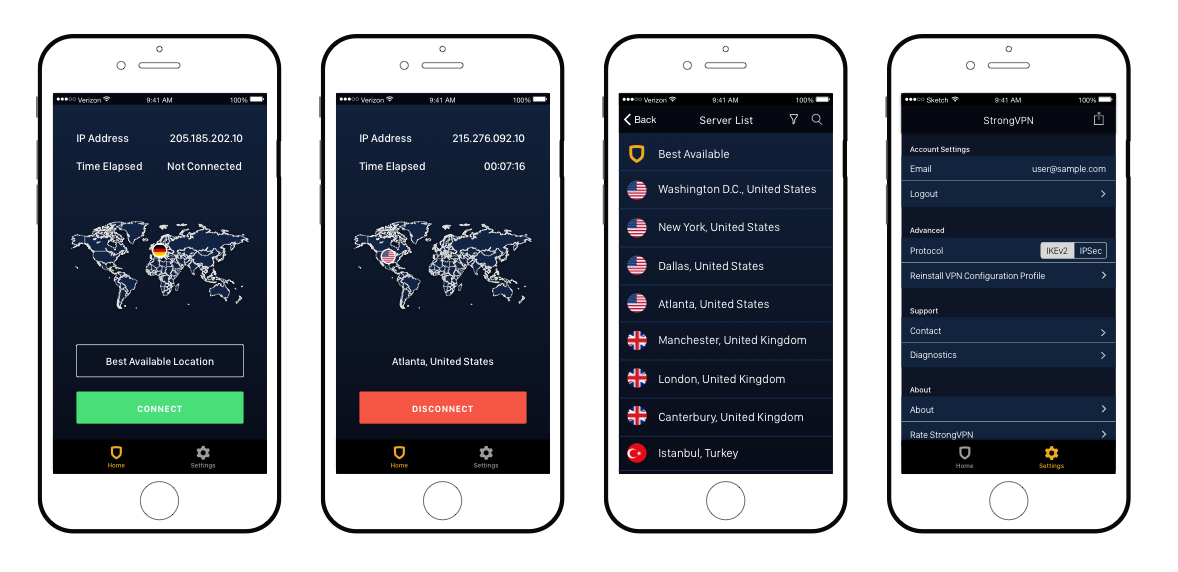
iOS
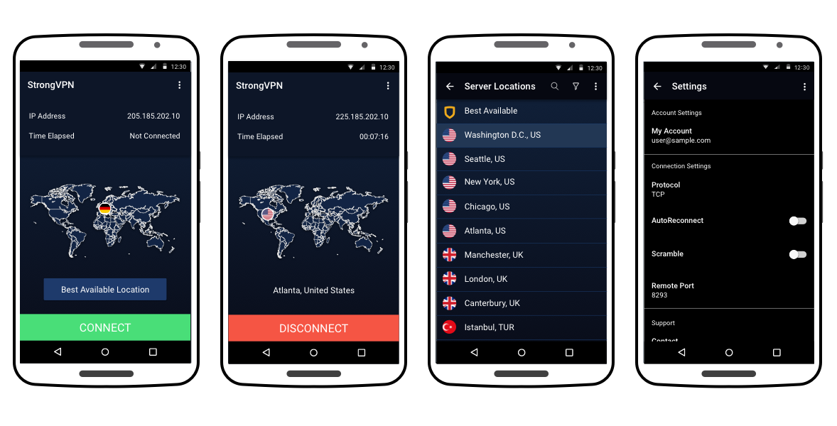
Android
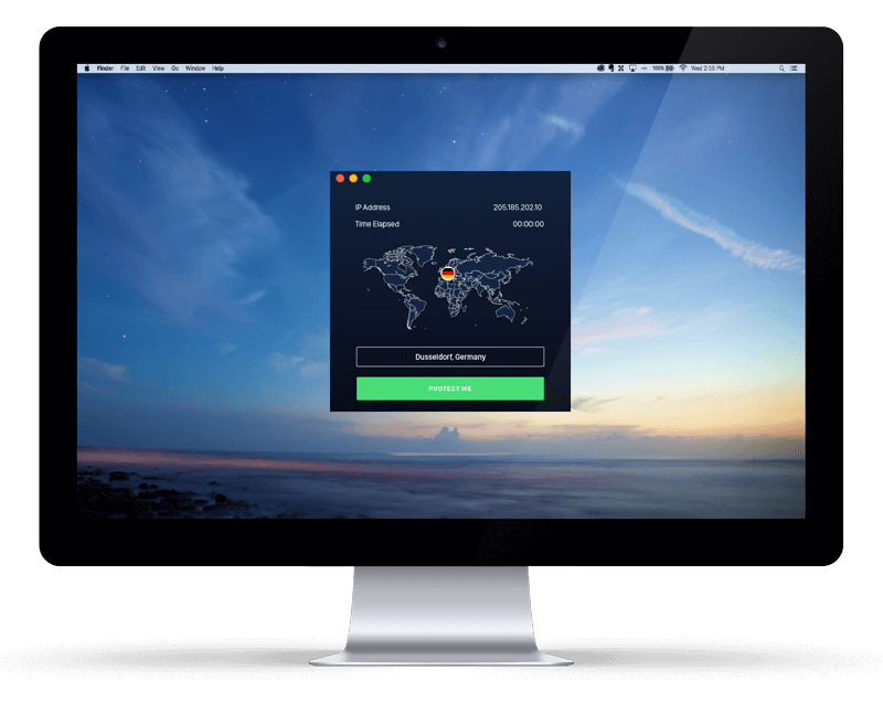
OSX

Windows
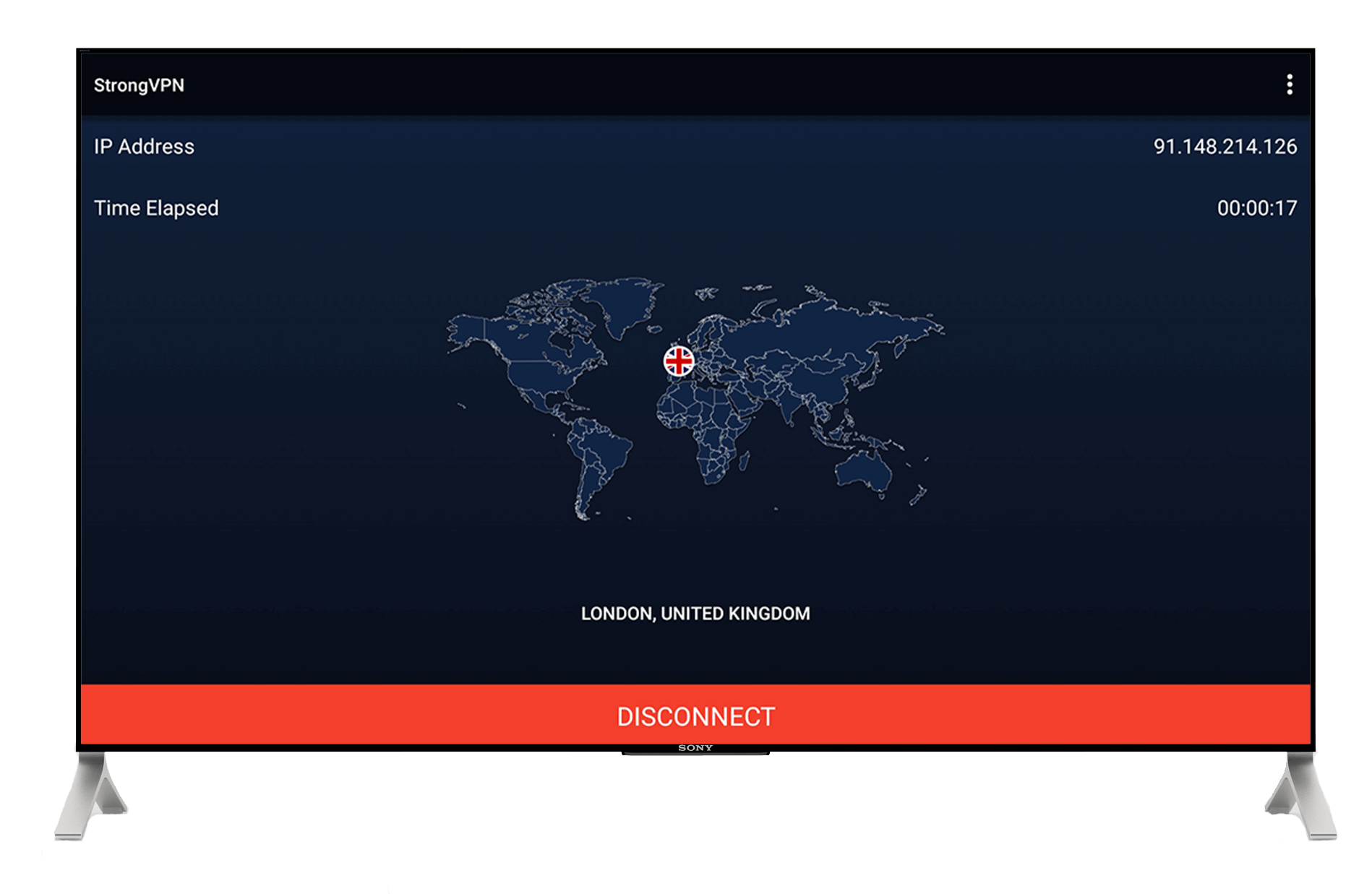
Android Tv